


Key Takeaways
- Choose colours with the room’s actual daylight, shading and evening lighting.
- Compare paint with floors, cabinetry and fabrics rather than in isolation.
- Use related colours across storeys without expecting identical appearances.
- Approve physical samples and finish specifications before full painting begins.
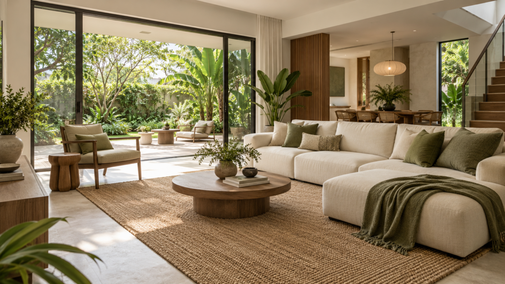
Colour palettes for Singapore landed homes work best when they are tested in the actual rooms alongside fixed materials and intended lighting. Begin with a small group of compatible colours, then compare them at different times of day. There is no single warm or cool palette that automatically suits every Singapore property.
A landed house may contain bright garden-facing rooms, shaded bedrooms and deeper circulation areas within the same plan. The same paint can look different across those conditions. Treat that variation as part of the design process rather than assuming a colour selected from one screen or showroom will behave identically everywhere.
Test the Colour Under More Than One Light Source
Dulux’s guidance on how light affects colour recommends testing a chosen shade in the room at different times and under different types of light. The useful principle is observation on site; examples based on another country’s orientation should not be applied mechanically to a Singapore house.
Start by recording when each room is used and what light it receives during those periods. A bedroom mainly occupied at night needs careful review under its evening fittings. A study used throughout the day should be assessed with its normal blinds or curtains in their usual positions.
Separate direct sunlight from general daylight and artificial illumination in your notes. A surface may receive one condition briefly and another for most of the day. Choose according to the room’s real use rather than its most flattering moment.
Build Colour Palettes for Singapore Landed Homes Around Fixed Materials
Identify the finishes that are expensive or inconvenient to change: flooring, major cabinetry, worktops and retained furniture. Their undertones should be part of the palette from the start. Paint is easier to adjust when those relationships are already understood.
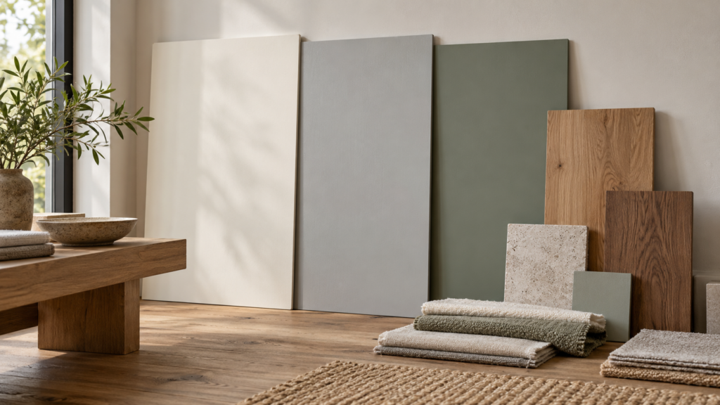
Arrange samples together in proportions that roughly reflect the room. A tiny timber chip beside a large paint card can give a misleading impression of their visual weight. Include fabrics and metal finishes where they will make a noticeable contribution.
Choose a background colour, a supporting group and a limited number of accents. This is a practical way to organise decisions, not a rigid formula. The amount of contrast should respond to room size, furniture and the atmosphere the household wants.
Use the landed interior design styles guide to connect colour decisions to the wider scheme. A palette should support the chosen materials and furnishing approach, rather than be selected independently and imposed on them afterwards.
Understand Warm and Cool as Relationships
Warm and cool descriptions help compare colours, but they do not provide a complete prediction of the finished room. An off-white can appear warmer beside a cool grey floor and less warm beside a strongly yellow timber. Review the combination rather than judging the paint name alone.
Compare a small shortlist side by side, then examine each candidate separately in the room. Adjacent samples can make subtle differences easier to see, while a larger isolated area helps you understand how the chosen colour will feel on its own.
Avoid assuming that a bright room always needs cool colours or a shaded room always needs warm ones. Both can work when the overall palette and lighting are considered. The question is whether the result supports the desired atmosphere and remains comfortable during ordinary use.
If a colour seems wrong, identify the cause before adding another finish. It may be the lighting, neighbouring material or level of contrast rather than the hue itself. Changing several elements at once makes it harder to understand which adjustment helped.
Review Orientation Together With Shading
The direction a window faces matters, but so do neighbouring buildings, overhangs, trees and curtains. Two rooms with a similar orientation may receive very different light. Observe the property rather than choosing solely from a compass label.
The sun orientation and shading guide for landed homes explains the wider planning context. For palette selection, note which surfaces receive strong sun and which stay shaded. That helps determine where a colour needs testing most carefully.
Check the normal window-treatment arrangement. A palette viewed only with every blind raised may look different once privacy requires them to be lowered. Include the fabric or screen material in the sample review because it becomes part of the room’s visible composition.
Consider views of greenery and adjoining surfaces too. They contribute to how the interior is perceived, especially through large openings. A palette can relate to the garden without requiring every indoor accent to repeat the same green tone.
Treat Glare and Reflectance as Separate Decisions
Colour is only one part of a surface’s appearance. Sheen, texture and the direction of light also affect what you see. A pale glossy surface can create a different experience from a similarly coloured matte finish.
Ask the supplier about the proposed product and finish rather than approving only a colour code. Review cleaning requirements alongside appearance, especially in high-touch areas. A finish chosen to reduce visible reflections still needs to suit its actual location.
Where glare is a concern, assess shading, fitting positions and reflective materials together. Repainting alone may not resolve a bright source reflected from a worktop or screen. The designer should review the whole visual condition instead of treating every discomfort as a colour problem.
Avoid assuming that darker paint makes a room physically cooler. Perceived atmosphere and thermal performance are different questions. Shading, glazing, ventilation and cooling need their own assessment when heat is the underlying concern.
Connect the Palette Across Several Storeys
Choose a few recurring background relationships for staircases, landings and connecting rooms. These may include a consistent wall family and related timber tones. The continuity helps the house feel coherent while allowing personal rooms to vary.
Do not expect the same paint to look identical on every floor. Light, ceiling height and adjoining finishes change the context. Decide whether that variation is acceptable before specifying a different shade simply to chase an exact visual match.
Review transitions from the main viewpoints. Look up the staircase, through doorways and across open living areas. A stronger bedroom colour may work well when it is not competing with several equally prominent surfaces from the entrance.
The guide to choosing a design style for a landed home can help establish which areas should be quiet and which can carry more personality. Colour selection becomes easier when the overall hierarchy of the house is already clear.
Use a Repeatable Sample Review
Prepare suitable sample boards or test areas using the intended product and application guidance. Record the colour code, finish and date so similar candidates are not confused. Check the sample against the actual flooring and cabinetry, not just a photograph of them.
Observe it in the morning, afternoon and evening when practical. Include the lighting settings the household expects to use. Ask residents to describe what they see and prefer, rather than relying on a single person to remember how the colour looked several hours earlier.
Digital tools can help narrow a shortlist, but they are not a substitute for the final physical check. Dulux’s colour accuracy guidance notes that on-screen colours cannot be guaranteed to match the actual product. Screens and photographs are useful references, not final approval samples.
Record the Final Specification Clearly
Confirm the selected product, colour, sheen and surfaces to be painted in one schedule. Include ceilings, trims and adjoining cabinetry where relevant. This prevents a correct colour from being applied in an unintended finish or location.
Keep the approved samples and review an initial finished area before work progresses throughout the house. If something differs, check the specification and lighting conditions before requesting broad changes. A deliberate sample process gives the family and contractor a shared basis for decisions.
Frequently Asked Questions
Are Warm Whites Always Better for Singapore Homes?
No. The result depends on daylight, artificial lighting and neighbouring materials. Compare a small shortlist with the actual floor, cabinetry and fabrics in the room. A warm white may suit one combination and appear too yellow in another, so test the relationship rather than relying on the label.
Can We Use the Same Paint on Every Floor?
Yes, if you accept that it may look different in different conditions. Review the main connecting views and test the colour in representative rooms. A consistent paint can provide continuity, but changing daylight and adjacent finishes mean it should not be expected to appear identical everywhere.
Is a Digital Colour Visualiser Enough for Approval?
No. It is useful for exploring options, but screens and photographs do not guarantee an exact match to the finished product. Confirm the final choice with a physical sample using the intended paint and sheen, viewed alongside actual materials under the room’s normal lighting conditions.
Will Dark Paint Make a Hot Room Cooler?
Do not assume so. A colour may change the perceived mood without resolving the source of heat. Review shading, glazing, ventilation and cooling separately with the relevant professionals. Choose paint for its role in the complete palette rather than treating it as a thermal-performance solution.

October 20, 2026
Yang's Inspiration Insight